PandaSuite Dashboard Redesign: Easier Navigation and a New Linux Export
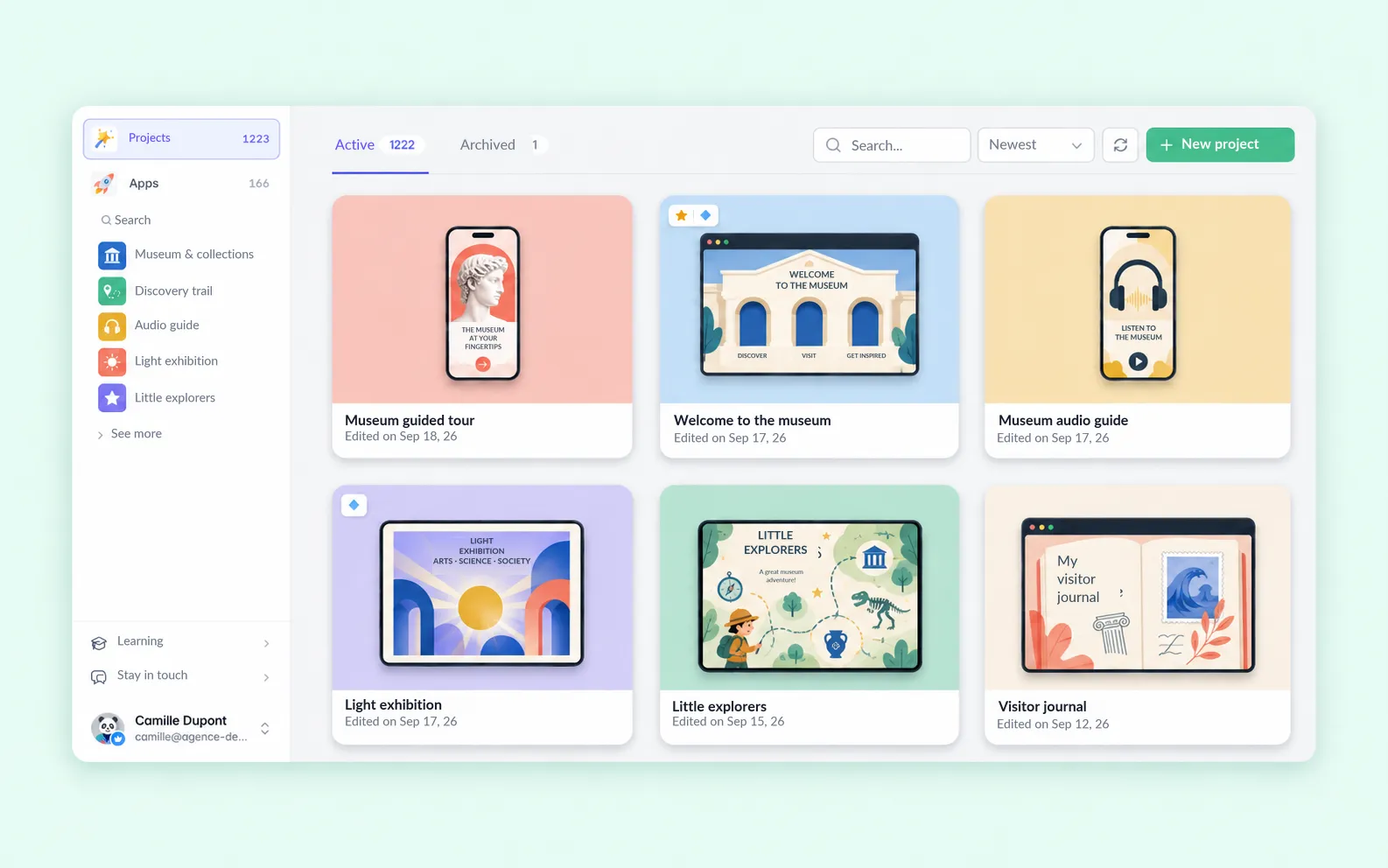
Before you create anything in PandaSuite Studio, you start in the dashboard. It’s where you find a project, create an app, copy a preview link, or get ready to publish. When that interface is no longer clear enough for a simple action and you have to contact support, it’s time to work on it!
So we overhauled it. This isn’t just a design job: more than half of the work happened under the hood.
We did it to make the dashboard better to use, and it’s also a cornerstone of our new Studio (shh, see you in 2027 ;)).
Here’s what’s new in the version now live.
Recognize the Right Project Before Opening It
Until now, two projects in the same format looked almost identical in the list. You often had to open them to find the right one.
Each project now appears on the device it’s designed for, with its home screen at its actual proportions. A mobile project looks like a phone, and a landscape project looks like a landscape screen.
You can rename a project directly in the grid. When the list is long, more projects load as you approach the bottom of the page; the button is still there for keyboard navigation.
Find an App Without Leaving the Page
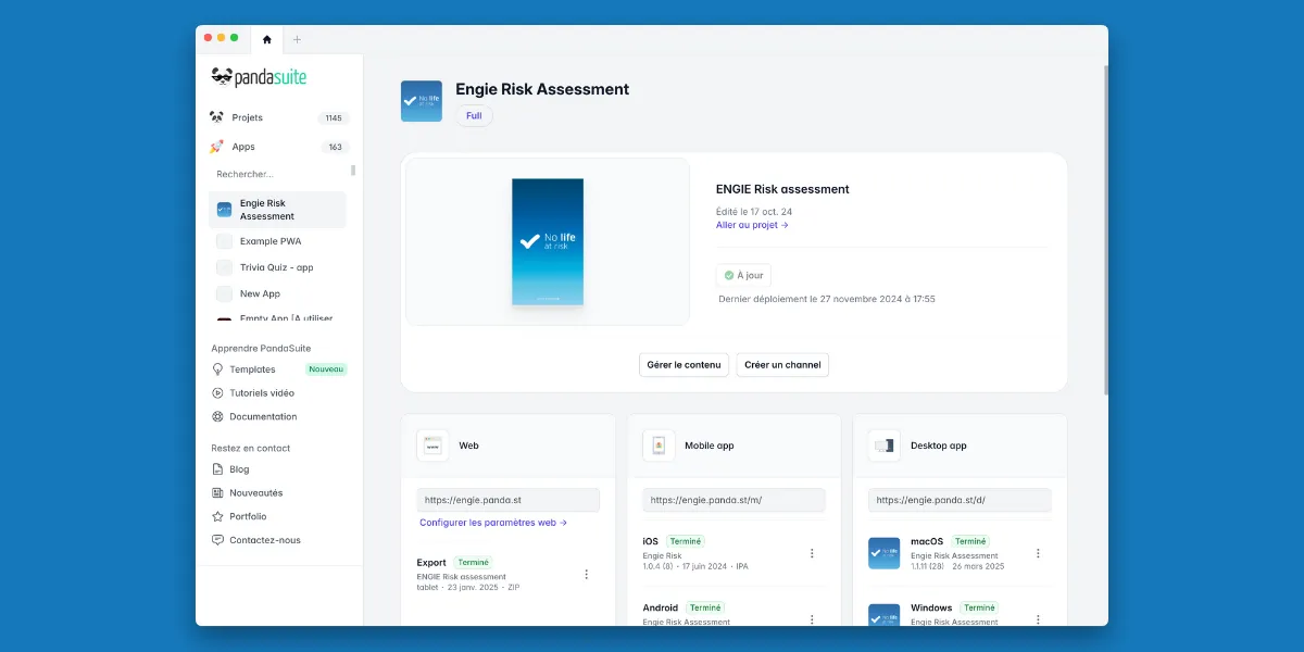
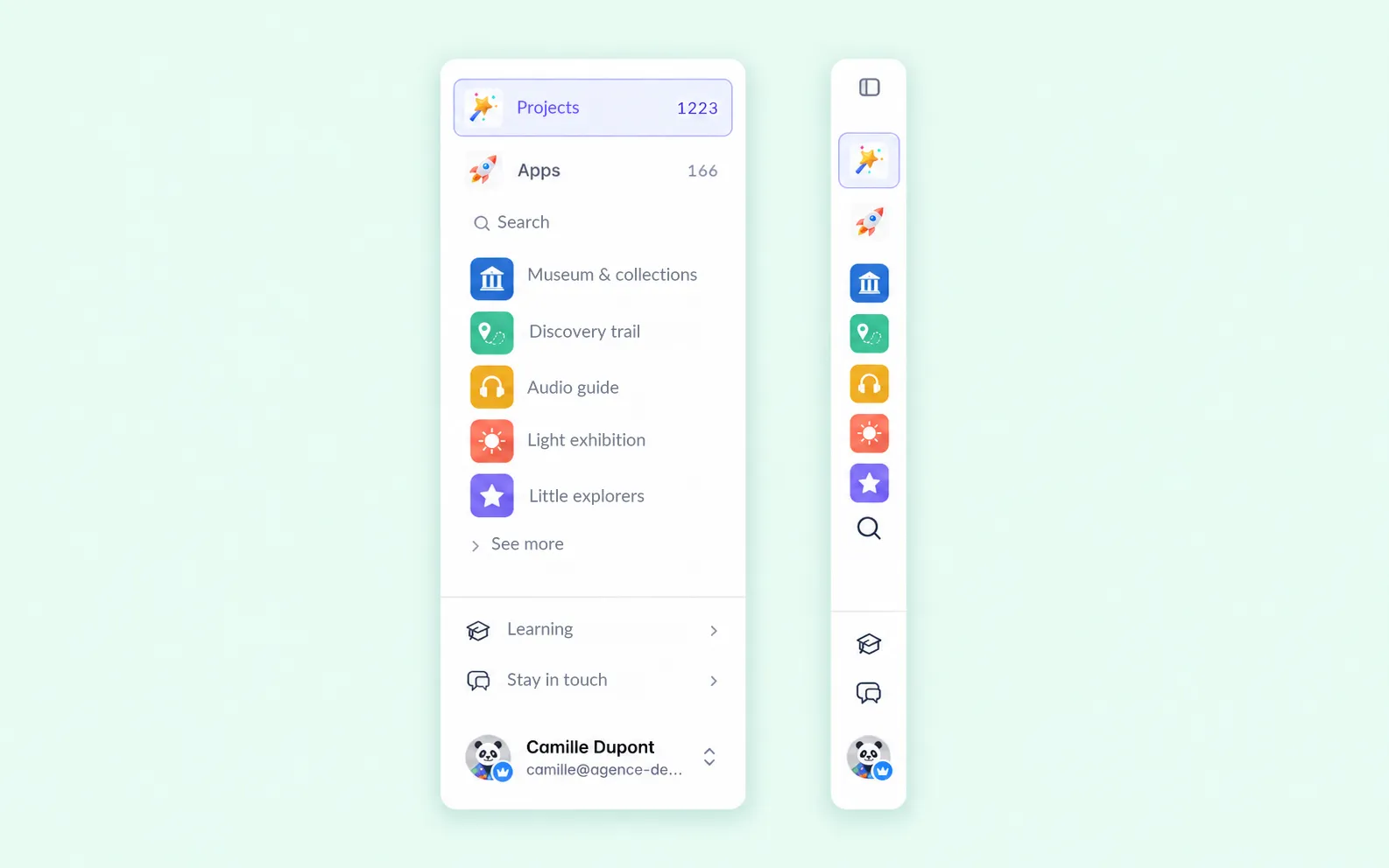
The new left column holds both levels of the dashboard. The Projects and Apps pages sit at the top. Your apps are listed right below, whichever page you’re on. You no longer have to go back to a full list to find the one you’re working on. A search field appears when the list gets longer, and you can collapse the column to leave more room for your projects.
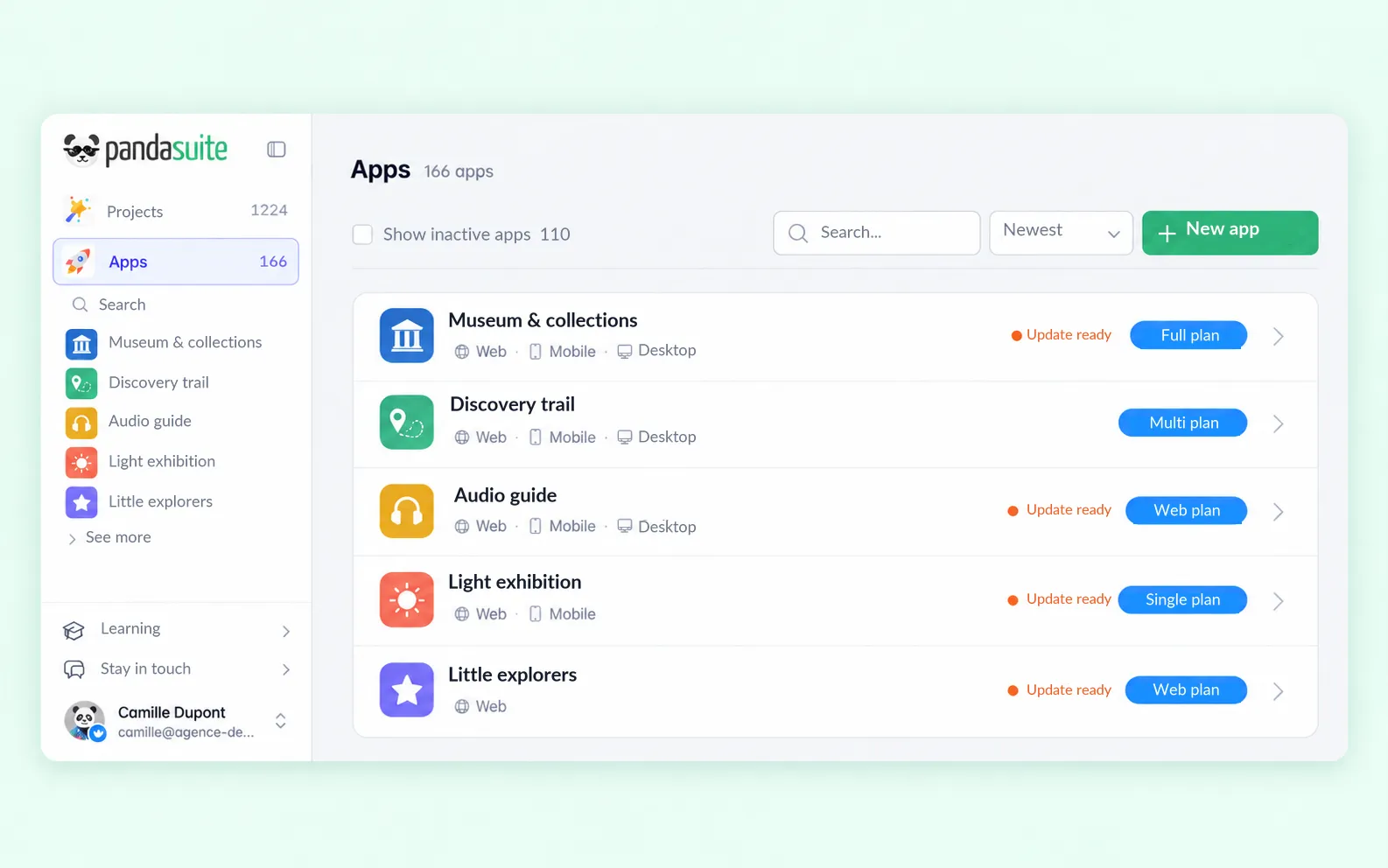
The new Apps page brings all your apps together in a single list. Each row shows the app’s plan and its platforms: web, mobile, or desktop. Expired apps are no longer set apart; a checkbox shows them alongside the others.
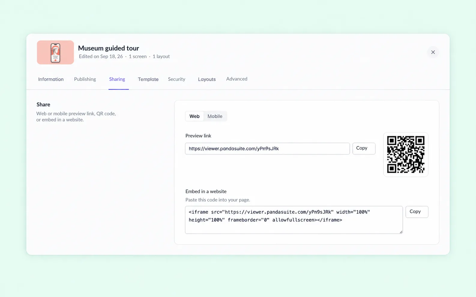
A project’s settings open on top of the list, in seven tabs: Information, Publishing, Sharing, Template, Security, Layouts, and Advanced. In the Sharing tab, the preview link, the QR code to scan with a phone, and the embed code are in the same place.
Small improvements like these add up every day.
Linux Joins Windows and macOS
The dashboard isn’t just for organizing projects. It’s also the starting point for getting your experience onto the device where it will actually run.
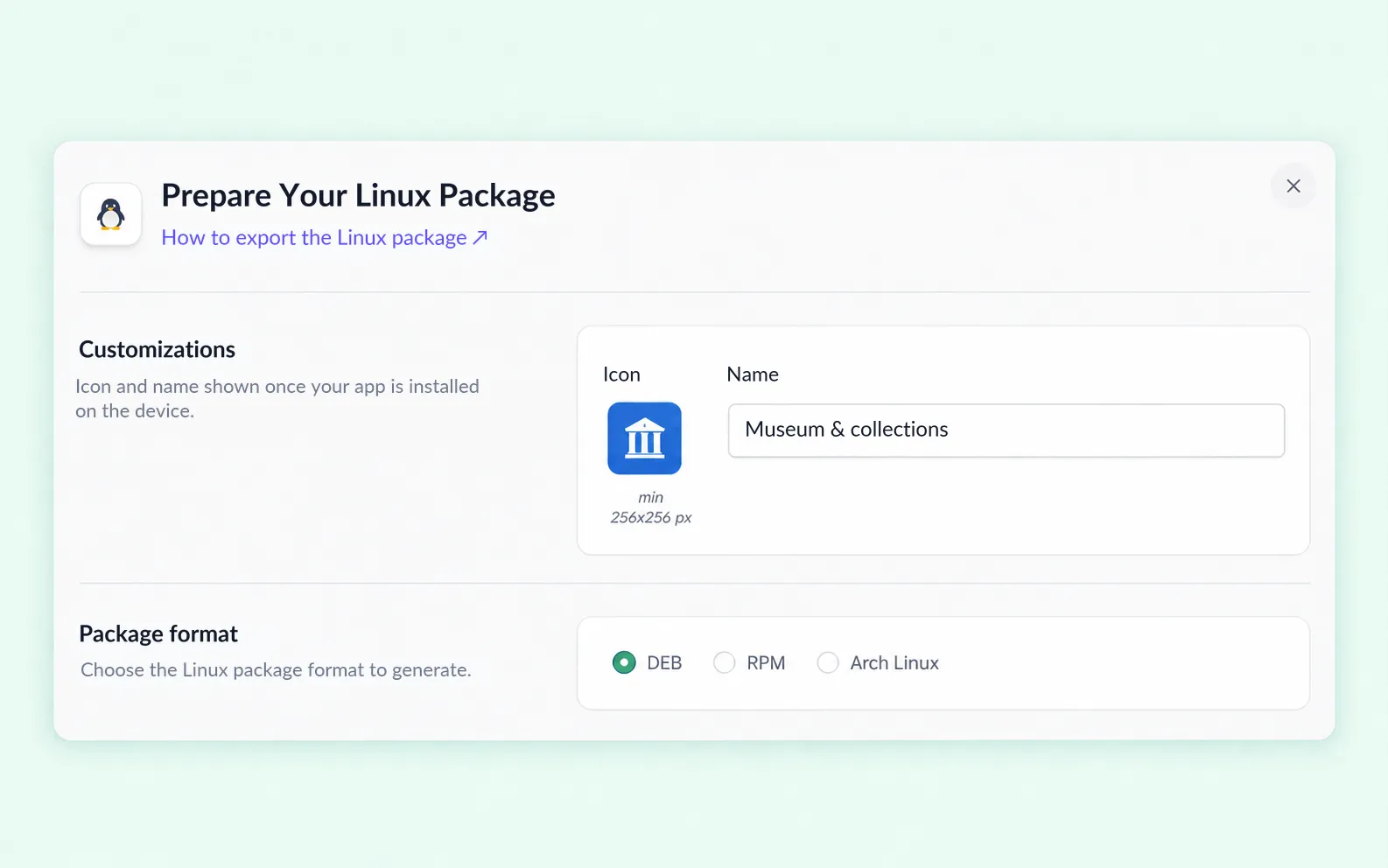
Your projects can now be exported as a desktop application for Linux, just as they already are for Windows and macOS. Three formats, depending on the machine: DEB, RPM, and Arch Linux. The flow doesn’t change: you choose the platform, start the generation, then download the application.
Light or Dark Mode, and Accessibility
The dark theme covers the entire dashboard, including windows, menus, and forms. Choose it in your account, or have it follow your computer’s setting.
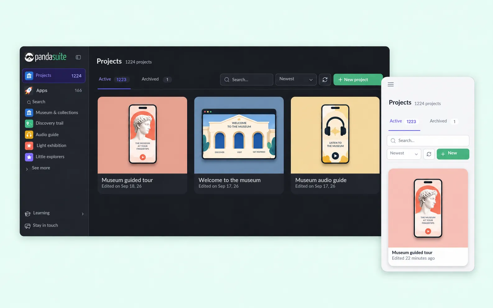
The dashboard also adapts to narrow screens. On a phone, cards switch to a single column and the navigation collapses. Search gets its own row; sorting, refreshing, and creating stay just below. Touch targets keep the size a finger needs.
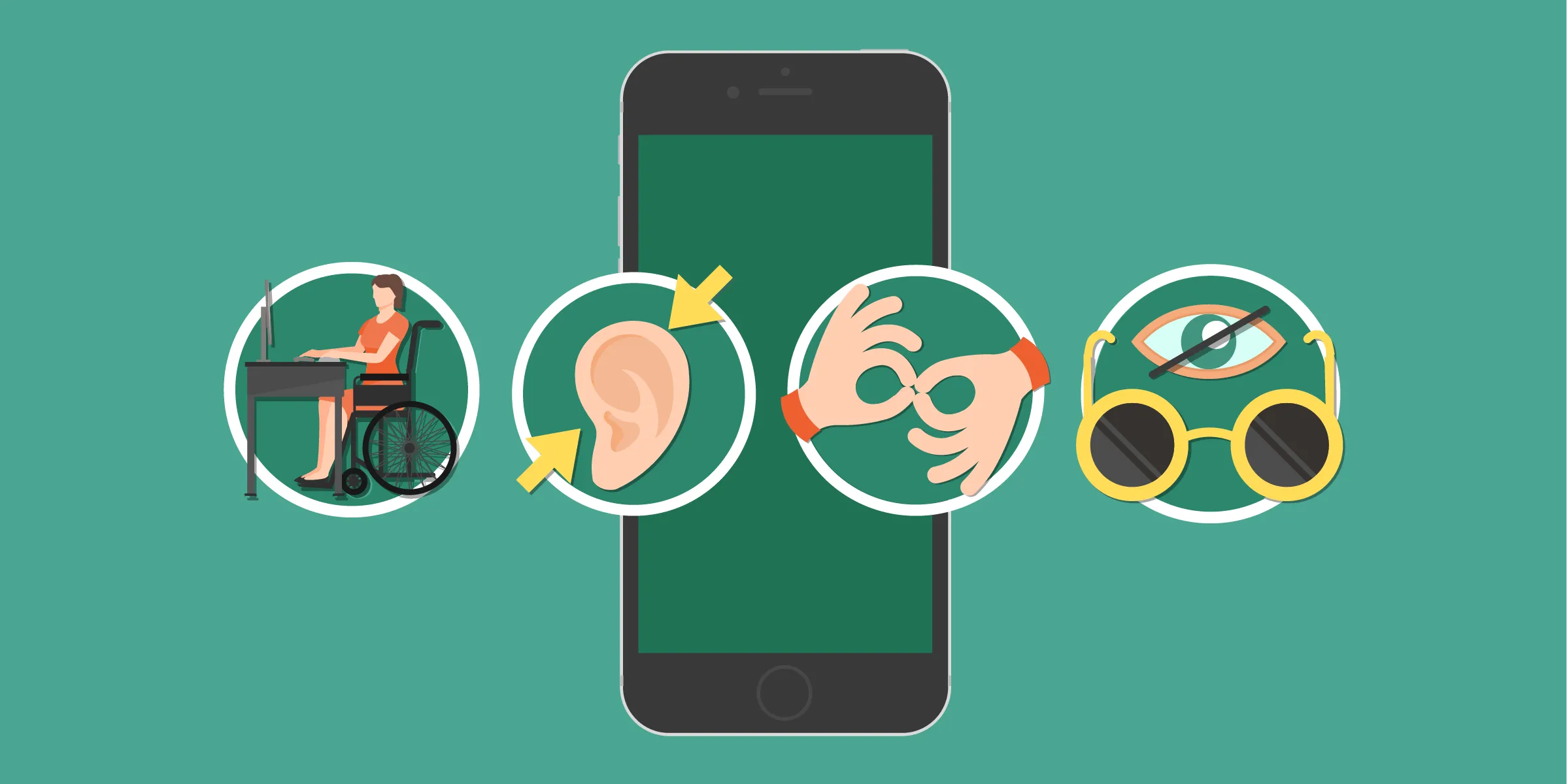
Redoing the look without revisiting accessibility would have left part of the job undone. You can now navigate the whole dashboard with the keyboard. Focus is always visible, and every control has a name a screen reader can announce. Zoom is no longer blocked on phones, and the browser’s text size applies everywhere. If the system asks for less motion or more contrast, the dashboard follows.
Everything else, from default colors to sizes, stays familiar. But an interface that’s readable in high contrast is also readable in bright sunlight. And keyboard navigation saves time for far more people than those who don’t use a mouse.
Four Changes Under the Hood
This redesign is meant to save you time, too:
- Pages load faster: the heavy data editor used to load on every page, even when nobody opened it. It now loads only when you need it.
- Browser tabs say what they contain: every page used to be called “Dashboard” in the browser. They now show “Projects · PandaSuite” or the name of the open app.
- Irreversible actions ask for confirmation: deleting a domain, removing a member from a company, or deleting an access rule no longer happens on the first click.
- Errors appear where they happen: if a file upload fails, the message stays under the relevant field instead of flashing across the top of the screen and disappearing.
The Beginning of Big Changes
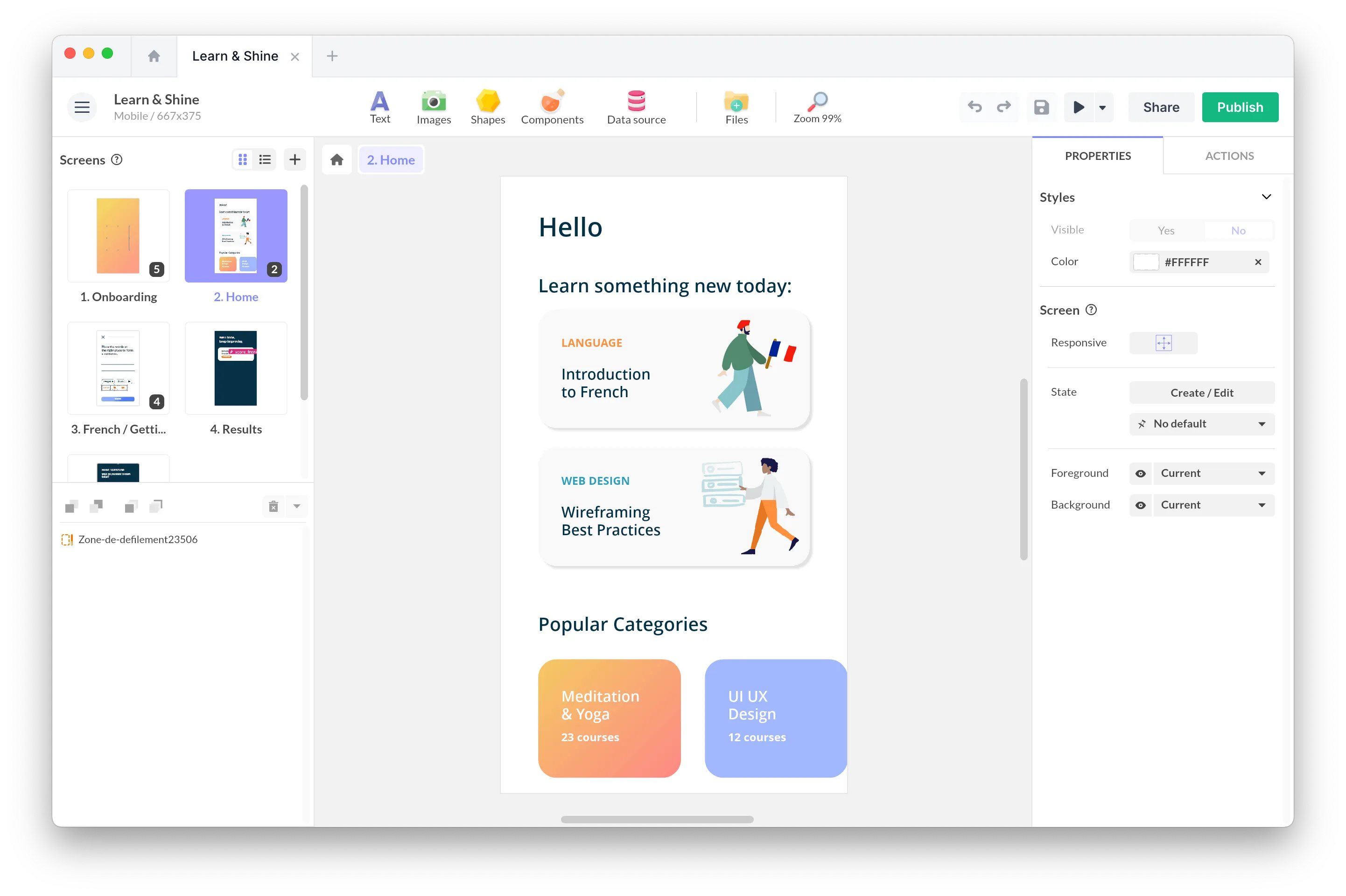
The dashboard and PandaSuite Studio do different jobs. The dashboard is for finding, organizing, configuring, and publishing projects. Studio is where you build screens, content, and interactive logic. We started with the dashboard because it frames everything else: a consistent visual foundation, accessible components, clear navigation, and a tested architecture. That’s what the next steps are built on.
Have you tried the new dashboard? Tell us what’s still missing. That’s how we’ll build what comes next.