Interactive Infographics: How to Bring Your Data to Life

If you’ve produced a document packed with figures and data (annual report, technical manual, etc.), you already know the problem: how do you make that content accessible to your readers?
Your content is valuable, but if it’s too long or too dense, it won’t get read and the key information won’t land. Screens and digital have trained our brains to access information quickly, and unfortunately our attention spans keep shrinking.
This is exactly where interactive infographics shine. They turn a dense document into a visual, exploratory journey, where the reader picks what interests them, at their own pace and in the order that suits them.
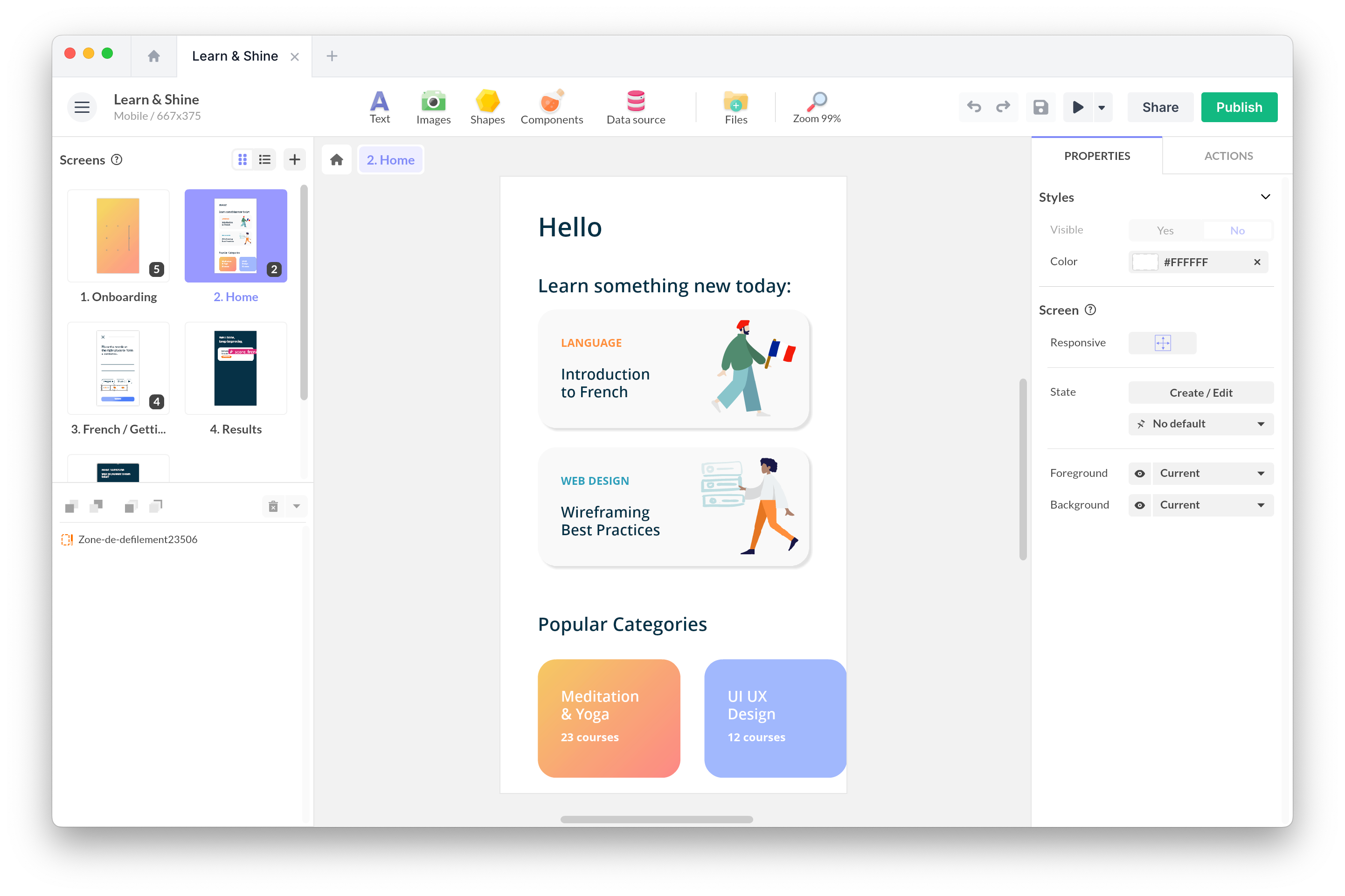
Here’s an example of an interactive infographic created to inform Val d’Oise residents about the arrival of fiber optic in their town.
Fibre Val d’Oise interactive infographic
This article walks you through when to use the format, how to structure it, and which tools to consider.
What is an interactive infographic?
An interactive infographic combines two things: an infographic (a visual representation of information) and interactivity (the reader becomes an active participant rather than a passive viewer). It’s used to make complex information accessible, understandable and memorable.
The format is widely used in online media, education, corporate communication and product marketing. It saw a first boom around 2010 with the rise of flat design, and a second one with the spread of no-code tools that put production within reach of marketing teams, without depending on a developer.
When interactive infographics really shine
Four use cases make the format particularly effective.
-
Explaining a complex technical subject: an industrial B2B product sheet, a manufacturing process, a regulatory diagram… By leading with visuals and clearly ranking information, you offer a more educational approach.
-
Qualifying an audience through clicks: an infographic with non-linear paths generates exploitable behavioral data. The most consulted areas reveal what your readers actually care about, which is useful for shaping your next content or a sales follow-up.
-
Smoothing out a sales meeting: on a tablet during a meeting, an interactive infographic can replace PowerPoint and give the salesperson a tool that adapts to who they’re talking to. You explore the areas relevant to that specific client rather than running through a fixed deck.
-
Extending the lifespan of a study: an annual report published as an interactive infographic gets read, shared and cited for months, whereas a PDF is more often consulted once and then forgotten in a drive.
Types of interactive infographics
Behind the generic term “interactive infographic”, several typologies coexist depending on the data and the mode of representation.
-
The interactive chart: ideal for displaying statistical data such as market share, sales or growth rates. Users interact with the charts to get detailed information area by area.
-
The interactive timeline: a temporal layout that displays information in a historical sequence. The reader navigates through time and explores the details of each milestone.
Timeline of the submarine Le Redoutable
-
The interactive map: data is represented geographically, with clickable points that reveal the information attached to each area. Particularly useful for tourism, real estate, or companies with an international footprint.
- Scrolling infographics (scrollytelling): information unfolds as the user scrolls the page, with animations and transitions that highlight key points. A format especially well suited to long narrative stories and case studies.
Ingredients of a successful interactive infographic
Every interactive infographic shares a few common elements:
- Buttons or clickable elements: they typically reveal information layered above the illustration.
- Animations: they add modernity and dynamism. Simple transitions or motion design animations built with AfterEffects and Lottie — there’s something for every taste.
- Zoom capability: buttons let you focus on a part of the infographic and dig into more content.
- Media: short videos, images and audio used to reinforce understanding.
- Quizzes
It’s not the number of interactive elements that makes it work, but the coherence of the journey and the quality of the content.
A few tools to create an interactive infographic
The market has become widely democratized since 2020. Several categories of tools exist, depending on your scope:
-
Specialized data-viz tools (Flourish, Datawrapper, Infogram): excellent for interactive statistical charts, with real rigor around data visualization. Web only.
-
Generalist design-oriented tools (Genially, Visme, Ceros): more layout freedom, designed for marketing and communications teams. Web only.
-
Multi-platform tools (PandaSuite, Intuiface): they let you deploy the infographic on web, mobile, physical kiosk, and offline, from a single source file.
The right choice mostly depends on where you want to distribute. For a web infographic embedded in an article or annual report, data-viz or design-first tools are enough. For a tailor-made, multi-platform experience (web, tablet and kiosk), it’s better to start with a multi-platform tool from day one.
In short
The interactive infographic is a format that reshapes how an audience absorbs complex information. It’s now accessible to everyone through no-code tools.
The real question is the content itself: what message do I need to convey? Which areas deserve a second-level exploration? Who are the readers who will watch without clicking, and what should I tell them too? Answering those three questions will dictate everything else, far more reliably than the choice of tool.
FAQ
What’s the difference between a static and an interactive infographic?
A static infographic is consumed passively: the eye scans the image at a glance. An interactive infographic requires the reader to click, scroll or hover to gradually reveal information. Both formats have their place: static works for dense, synthetic messages, interactive for subjects that deserve deeper exploration.
How long does it take to produce an interactive infographic?
A simple infographic (3 to 5 areas, clean design, light animations) can be produced in a few days by a self-sufficient marketing team with a good no-code tool. A more ambitious infographic (10+ areas, motion design, live data integration) takes two to four weeks, often in collaboration with a designer or a studio.
What budget should I plan for?
In-house with a no-code tool, the budget comes down to person-time (one to five days typically) and the tool license. With an agency, expect anywhere from €3,000 to €15,000 depending on complexity, knowing that a large share of that cost goes to the agency itself, not to the format.
Which sectors get the most out of interactive infographics?
It works particularly well for sectors with heavy technical or regulatory content: industry, energy, banking and insurance, healthcare, education, real estate…
It’s also widely used by media outlets and NGOs to communicate complex data.
How do you measure the effectiveness of an interactive infographic?
Several metrics are usable: completion rate (how many visitors explore the whole thing), most consulted areas (reveals what the audience actually cares about), average time spent, social sharing…